LOVEVERY
Play Kits Landing Page
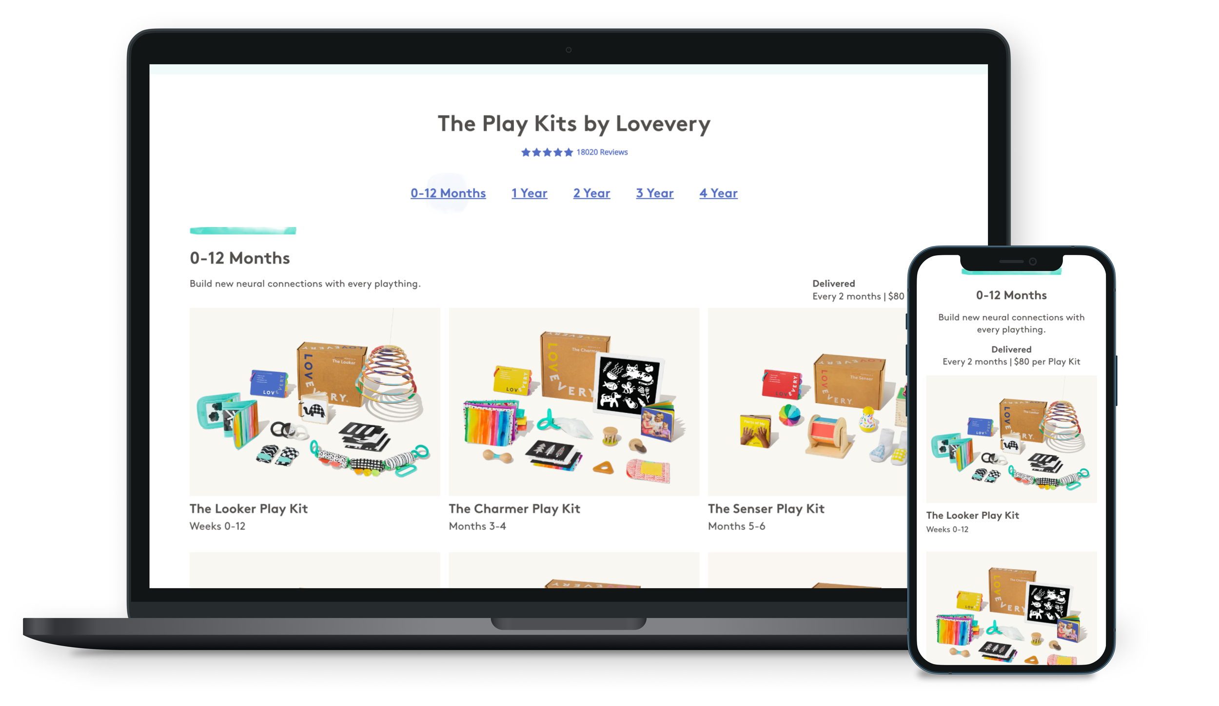
The Play Kit landing page is Lovevery’s primary entry point for organic traffic and starts our subscription process. Initially designed by Pantagram at our launch, the page became outdated as our product range expanded. With the introduction of our 3-year-old Play Kits, the page became too lengthy, prompting us to seize the opportunity to better cater to our evolving customer needs.
My Role
UX strategy, UI design
UX research planning and support
Creative asset advisory
Stakeholder communication and presentation (product marketing, lifecycle, growth, engineering)
Analyzing Problem Areas with Existing Page
DEFINING GOALS
The project initially aimed to create a shorter mobile web page. However, we identified various opportunities to improve the Play Kit Landing page to meet important KPIs. Stakeholder interviews with performance marketing, e-commerce marketing, product, and tech teams revealed areas where we could make significant progress on the business side.
Stakeholder Needs
Make space for 3 YO kits, preventing an infinite scroll
Optimizing for Europe, ensuring we can localize and not just translate
Prioritize the values and benefits while also providing an in-depth exploration of each kit
We’re currently lacking an version of a product detail page to directly link customers from our paid ads to our subscription funnel
Fix out of date marketing and elevate our brand
Address accessibility issues in our UI
Prioritizing the Why
CONTENT STRATEGY
One of the first thing I noticed when beginning to rethink this landing page was that the current page had a tremendous emphasis on the HOW and the WHAT and not so much on the WHY. Customers are familiar with subscription products and we were using our most valuable real estate at a key touchpoint to explain the way our subscription functioned.
Our products are not only impactful but also beautiful. My goal in this redesign became to use this entry point to tell a story about the values and benefits of becoming part of the Lovevery community. I set out to tell our story through elevated visual imagery (color, movement) and focused branded copy.
I partnered with our growth team to understand which winning ad copy we can repurpose to describe our Play Kits. For our early prototypes we played around with headlines like “Make the Most of Playtime”, “More than a box of toys” and “The Right Toys at the Right time”.
CREATIVE STRATEGY
Rethinking Creative
Lovevery Play Kits stand out in the market due to their exceptional quality and craftsmanship. Our research and analytics revealed that users enjoy thoroughly examining each toy before committing to a subscription. However, our current flatlay image, while playful in line with our brand, lacked the interactivity and merchandising effectiveness we desired. Collaborating with the visual design and creative team, we explored ways to meet industry standards. By drawing inspiration from competing products and incorporating mood boards, we successfully showcased the beauty of our products while emphasizing their cohesive nature.
Photography
Teaming up with our video editing crew, we ventured into dynamic page content for the first time. Recognizing the significance of movement in showcasing our product's quality, uniqueness, and impact, we experimented with various iterations. Ultimately, we settled on a version that effectively showcased our products with clarity while emphasizing the parent-child connection.
Video
Addressing Core Functionality Issues
DESIGN PHASE
Once we determined the content strategy, we knew we had to addressing the functionality issues. The introduction of a product detail page, was a necessary step improving paid traffic and giving that highly-coveted look inside the box caregivers desired.
Looking inside each Play Kit and analyzing the developmental value of each object was crucial to conversion. The detail page would give them an in-depth product view while presenting the way the toys are strongest as a complete set. These pages would also solve our stakeholder needs by giving us a place to land paid traffic.
DATA
Social Proof
Our customers do the best job of all in driving excitement around our brand. It was important to bring their voice and images into the story of the Play Kits. I combed our Buy, Sell, Trade Facebook Groups and social media to find patterns around what I called “parent solution statements”. These were all the ways our products had made life easier for tired, busy new families. We lovingly refer to them now as “the 4Cs”:
Cost: “Lovevery makes life easier by reducing what I spend. These are the only toys I need".
Clutter: “My home is a mess now that baby is here and having fewer things promotes a sense of calm.”
Confidence: “Lovevery’s Play Guides and parent resources make me feel like I actually know what I’m doing as I find my footing”.
Convenience: “The Play Kits stage-based model means they show up at my door at exactly the right time. I don’t have time to think about another thing”
We paired these quotes with images from real Play Kit customers to highlight the reality, messiness and of course the gratitude and joy of new parenthood.
DESIGN
A New Design For Testing
Play Kit Landing Page: Leading with benefits and values based on headlines from winning ad copy, clear images of each kit together showcasing their cohesive value, Simplified How it Works focusing on the subscription not how to order with dynamic social proof.
New Product Detail Pages: An excellent place to land paid traffic so we can begin marketing to specific stages more effectively. Desktop and Mweb are highly customized to emphasize how the products compliment one another and how each stands on their own to aid child development. Finally, a tab for parents so they can understand Play Kits has a whole-family support system.
User Testing High Fidelity Prototypes
USER TESTING
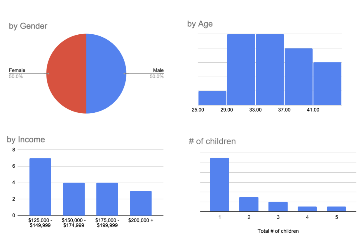
Once we had our prototype together, we conducted a rather large test (18 participants). All were “friendlies” who were familiar with our brand but not yet customers with a child under 2YO. I partnered with our research lead to create a strategy focused on testing individual elements of the page and form there figuring out how we can put elements in teh correct order on the page based on engagement.
Study Goal: Ensure that communication, functionality and wayfinding are basically working for the new Play Kits landing page. Is there anything we need to optimize before we launch?
Do users understand the play kit concept?
Do users understand that play kits are a subscription service?
Do users accurately understand what play kits cost?
Can users easily advance in the purchase flow?
Does the new landing page drive home the value and benefits of play kits?
User research strategy: testing each individual component on the landing page to inform content hierarchy and message effectiveness
Wins
LP and PDP successfully convey the basic product concept. All participants formed the accurate impression that play kits are subscription service of developmentally-targeted toys.
Core navigation is usable as intended. Users tapped on “try now” buttons, kit images to access PDP pages, swiped to view product ISOs on PDP, used left/right nav arrows to see other kits on PDP.
Opportunities
There is confusion around pricing, starting from the LP but extending into the sub flow. For some users, seeing $2 a day creates misleading expectation of a $2 trial or a $60 month cost. Some users expect to be billed monthly based on the payment options page in the subflow, and some were confused about when their subscription would end.
A lot of objections to cost—we’re not nailing the perception of value. Participants looked at the kit contents—and specifically the number of toys—to gauge value. Some did mental math to add up their own estimates based on standard toy prices. Need to address this objection more head-on. Participants who engaged with developmental content, and the existence of the Play Guide, spoke about kits more holistically as a tool to support their parenting. Elevating this messaging to the LP and strengthening the sense of “wholeness” of each kit on the PDP would likely increase perceptions of value.
Results
We launched this test on Optimizely on 10% of traffic and on hotjar. We saw the following results after a 7 day test
-11% reduction in bounce rate
+3% continue to checkout
Flat on subscription starts and new subscription conversion
We saw promising upticks on paid social, organic search while tablet/desktop traffic and affiliate marketing traffic were areas for improvement
Overall the team was excited to have a better sandbox to keep pulling levers for conversion.